99 stories
·
2 followers

The Washington Post on the EU’s DMA Folly

1 Comment

The Washington Post editorial board yesterday (News+ link), “Why Europe Won’t Have the New Siri”:

Brussels insists the decision is “Apple’s and Apple’s only” and that nothing in its flagship Digital Markets Act forbids the launch. That’s technically true and wholly beside the point.

The law requires that the moment Siri AI ships in Europe, any rival AI agent must get the same sweeping access to a user’s messages, files and chat history. Apple proposed putting in a software security layer to make that safe and offered a phased rollout to build it. According to Apple, the European Commission rejected the proposal.

The DMA was supposed to open markets. But its legal logic was born in the era of browsers, app stores and messaging apps. These components can be swapped like batteries.

The DMA effectively demands everything to be swappable/interchangeable. So while the European Commission is correct that the DMA does not forbid Apple from launching a version of Siri AI, it clearly forbids Apple from launching the version of Siri AI they actually built.

Behind all this lies the dream that Europe could be a “regulatory superpower.” It wanted to create a market too big to skip that would, by virtue of its heft, end up exporting its rules to the rest of the world. That hasn’t worked out.

When adapting a product for Europe costs more than European market access is worth, companies no longer comply. They simply leave out the feature.

That’s the folly of the DMA, or at least the maximal interpretation of the DMA that the European Commission is pursuing. It only makes sense under the assumption that the EU is too big a market to ignore, and the EU’s market might is such that systems will be designed to meet their compliance standards, regardless of whether the makers of these systems support the regulations or not. (And in the case of Apple with iOS and Google with Android, the two companies are in lockstep in their opposition to the EU’s regulations on system-level AI interoperability.)

First, the EU is big but it isn’t that big. The best estimate I’ve seen is that the EU accounts for about 7% of Apple’s worldwide revenue. Plus, because of the DMA, the cost of doing business in the EU is now significantly higher for Apple and Google, because they need to engineer DMA-compliant versions of various features and systems. Unless, that is, they stop bringing (a long and ever-growing list of) new features to the EU.

Which brings me to my second point. What exactly is the motivation for Apple and Google to engineer entirely separate systems for the EU to bring new features into compliance with the Commission’s broad interpretation of the DMA? Because if Apple doesn’t engineer a DMA-compliant version of Siri AI, iOS users in the EU will ... switch to Android, whose system-level AI was deemed noncompliant by the Commission a few months ago?

This doesn’t directly hurt Apple. It doesn’t force Apple to design, engineer, and ship a compliant EU-exclusive version of Siri AI that supports plug-and-play LLM back ends. It only hurts iPhone users who live in the EU, who are stuck with the old dumb version of Siri for the foreseeable future. The European Commission is either stupid or insane.

Link: washingtonpost.com/opinions/2026/06/14/apple-withholding…

Read the whole story
leonick
1 day ago
reply
"it clearly forbids Apple from launching the version of Siri AI they actually built."

They don't need to design compliant versions of features, they could designed them to be compliant from the start. They already plan to be compliant, they just hoped for some time with no competition.
Sweden
Share this story
Delete

★ Why It’s Difficult to Resize Windows on MacOS 26 Dyehoe

1 Comment

Norbert Heger, with a perfectly illustrated post, “The Struggle of Resizing Windows on macOS Tahoe”:

Since upgrading to macOS Tahoe, I’ve noticed that quite often my attempts to resize a window are failing. This never happened to me before in almost 40 years of using computers. So why all of a sudden?

It turns out that my initial click in the window corner instinctively happens in an area where the window doesn’t respond to it. The window expects this click to happen in an area of 19 × 19 pixels, located near the window corner.

If the window had no rounded corners at all, 62% of that area would lie inside the window.

But due to the huge corner radius in Tahoe, most of it — about 75% — now lies outside the window.

Here is Heger’s illustration of the hit target for the invisible resize button on MacOS 26:

Screenshot illustrating the hit target for where you can click to initiate resizing a window in MacOS 26.

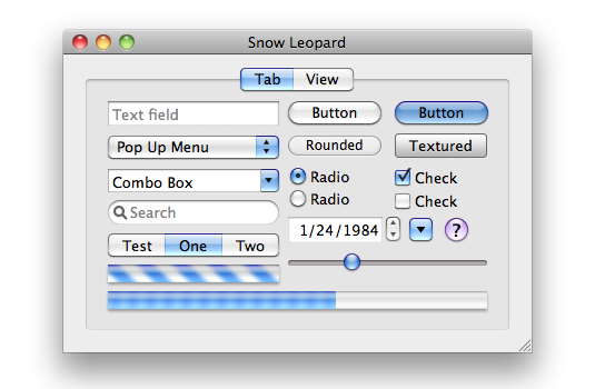
It was, I’d argue, a small mistake for Apple to stop putting a visual affordance in the lower right corner of windows to show where to click to resize the window. It was a bigger mistake to change the scrollbars on MacOS to look and work like those on iOS — invisible, except while you’re actually scrolling (by default, that is — savvy Mac users keep them always visible). The removal of the resize indicator happened long ago, in Mac OS X 10.7 Lion, released in July 2011. John Siracusa’s 10.7 review illustrates the before and after. Before (10.6):

Screenshot illustrating the standard GUI controls of Mac OS X 10.6 Snow Leopard.

After (10.7):

Screenshot illustrating the standard GUI controls of Mac OS X 10.6 Snow Leopard.

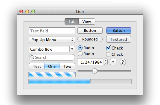
I think everything about the 10.7 Lion GUI looks better than the 10.6 Snow Leopard GUI — except for the omission of the resize affordance in the corner. The visible resize affordance didn’t just tell you where to click to resize the window, it also told you that the window could be resized in the first place. In 10.6 and earlier, a window that could be resized showed you that it could be resized because it had a visible indicator. Windows that didn’t have that indicator were windows whose size was fixed. From 10.7 through today, the only way to know if a window even can be resized is to move your mouse cursor to the corner and try. The grippy-strip affordance offered contextual information about the window.

I can imagine the thinking at Apple behind this change, 15 years ago. The visible grippy-strip affordance in the lower-right corner isn’t really necessary. All users “know” that they can resize windows by clicking and dragging from the corner. And, although in ancient times users could only resize windows by clicking in the affordance in the lower-right corner, by 2011 it had long been the case that users could resize windows in two dimensions starting from any corner, or in one dimension starting from any edge of the window. (But windows on the Mac used to have visible edges denoting the window chrome, too. The Mac’s history is replete with glorious examples of UI clarity and precision.) So why draw the resize affordance in the lower-right corner when you can resize from any corner or window edge? Plus, the space for the lower-right grippy-strip affordance was made by the empty space at the intersection of vertical and horizontal scrollbar channels — and since Apple decided to make scrollbars invisible (by default) in Mac OS X 10.7 in 2011, there was no longer an otherwise unused square space in the corner for the resize affordance to be drawn. (It was sort of like the Free Parking space on a Monopoly board.)

One can argue with the logic behind these changes, 15 years ago. I’ll repeat that I think it was a grave error to make scrollbars invisible by default. I would argue that while the visible grippy-strip isn’t necessary, it’s nice to have. (As noted above, its presence showed you whether a window could be resized.) But there was, clearly, logic behind the decisions Apple made in 2011. They were carefully considered. The new logic was that you no longer look for a grippy-strip to click on to resize a window. You simply click inside the edge of a window. And of course Apple added a small affordance to the hit target for those edges, such that if you clicked just outside the window, that would count as “close enough” to assume you intended to click on the edge. Most users surely never noticed that. A lot of nice little touches in UI design go unnoticed because they’re nice little touches.

Until MacOS 26, most of the hit target to initiate the resizing of a window was inside the window. Because, of course, right? Even though MacOS (well, Mac OS X) stopped rendering a visible resize grippy-strip 15 years ago, the user could simply imagine that there was still a grippy area inside the lower right corner of every resizable window. It would make no sense whatsoever for the click target to resize a window to be outside the window. Why would anyone expect that? It would work against what our own eyes, and years of experience, are telling us. You pick up a thing to move it or stretch it by grabbing the thing. Not by grabbing next to the thing.

The windows on MacOS 26 Tahoe don’t really have comically large, childish corner radiuses. They just look like they do because some jackasses at Apple — all of whom, I pray, are now at Meta — thought they looked better that way. It’s a straight-up inversion of Steve Jobs’s maxim that design is about how things work, not how they look. I can think of no better example to prove that the new UI in MacOS 26 Tahoe was designed by people who do not understand or care about the most basic fundamental principles of good design.

The good news is, I have a solution. Do not upgrade to MacOS 26 Tahoe. If you have already upgraded, downgrade. Why suffer willingly with a user interface that presents you with absurdities like window resizing affordances that are 75 percent outside the window?

Read the whole story
leonick
155 days ago
reply
I'd never really thought about this. If we still had borders on windows then obviously that's what you would click to resize. Without a borde my expectation would be an areas inside and outside the window. Well, I checked on Windows and two desktop environments on Linux (Gnome, Cinnamon) as that is what I use, turns out the clickable area for resizes is all outside the window with the exception of some non-native (electron) apps like Discord where it might be inside the window...
Sweden
Share this story
Delete

Apple to Resist Order in India to Preload State-Run App on iPhones

1 Comment

Aditya Kalra and Munsif Vengattil, reporting for Reuters:

Apple does not plan to comply with a mandate to preload its smartphones with a state-owned cyber safety app and will convey its concerns to New Delhi, three sources said, after the government’s move sparked surveillance concerns and a political uproar.

The Indian government has confidentially ordered companies including Apple, Samsung and Xiaomi to preload their phones with an app called Sanchar Saathi, or Communication Partner, within 90 days. The app is intended to track stolen phones, block them and prevent them from being misused.

The government also wants manufacturers to ensure that the app is not disabled. And for devices already in the supply chain, manufacturers should push the app to phones via software updates, Reuters was first to report on Monday. [...]

Apple however does not plan to comply with the directive and will tell the government it does not follow such mandates anywhere in the world as they raise a host of privacy and security issues for the company’s iOS ecosystem, said two of the industry sources who are familiar with Apple’s concerns. They declined to be named publicly as the company’s strategy is private.

The second source said Apple does not plan to go to court or take a public stand, but it will tell the government it cannot follow the order because of security vulnerabilities. Apple “can’t do this. Period,” the person said.

To my knowledge, there are no government-mandated apps pre-installed on iPhones anywhere in the world. I’m not even sure how that would work, technically, given that third-party apps have to come from the App Store and thus can’t be installed until after the iPhone is configured and the user signs into their App Store Apple Account.

The app order comes as Apple is locked in a court fight with an Indian watchdog over the nation’s antitrust penalty law. Apple has said it risks facing a fine of up to $38 billion in a case.

This is another one of those laws like the EU’s DMA, where maximum possible fines are based on a percentage of global revenue. No one in India seems to actually be threatening any such fine, but it’s ludicrous that it’s even possible.

Read the whole story
leonick
197 days ago
reply
"possible fines are based on a percentage of global revenue. ... but it’s ludicrous that it’s even possible." It's that or fines that billion to trillion dollar companies like Apple can just pay like a cost of doing business. Maybe 100% of regional revenue could work too, but I bet Gruber wouldn't like that either.
Sweden
Share this story
Delete

Nice Web Design Work From ‘In Common With’

1 Comment and 2 Shares

Toggle the “Light” switch here. It’s going to do what you hope it does. (Via Jason Fried.)

Read the whole story
leonick
216 days ago
reply
Except for the most expensive lamp, it was photographed on a different background and not with the light on. Also, thousands of dollars for a lamp?! I know the US has far too many billionaires but come on, even $545 (the cheapest) is absurd for a table lamp.
Sweden
Share this story
Delete

Google Reverses Course, Will Keep goo.gl Links Redirecting

1 Comment

Google:

While we previously announced discontinuing support for all goo.gl URLs after August 25, 2025, we’ve adjusted our approach in order to preserve actively used links. We understand these links are embedded in countless documents, videos, posts and more, and we appreciate the input received.

Nine months ago, we redirected URLs that showed no activity in late 2024 to a message specifying that the link would be deactivated in August, and these are the only links targeted to be deactivated. If you get a message that states, “This link will no longer work in the near future”, the link won’t work after August 25 and we recommend transitioning to another URL shortener if you haven’t already.

All other goo.gl links will be preserved and will continue to function as normal. To check if your link will be retained, visit the link today. If your link redirects you without a message, it will continue to work.

Nice!

Read the whole story
leonick
318 days ago
reply
Nice, sure, but if they keep goo.gl around why not keep all links? If it isn't commonly used it's a low or no cost link to maintain, no? Not enough tracking potential?
Sweden
Share this story
Delete

Microsoft claims 'Windows 11 24H2 is our most reliable version of Windows yet', which would be a welcome change

1 Comment and 2 Shares

Microsoft is awfully proud of its latest version of Windows, as it claims it's now less prone to failure. This would make for a pleasant change, as the first few months with the software were not great, to put it lightly.

As noted in the Microsoft blog, “We’re also proud to share that Windows 11 24H2 is our most reliable version of Windows yet. Compared to Windows 10 22H2, failure rates for unexpected restarts have dropped by 24%." The data was sourced from Reliability telemetry collected by Microsoft in July 2025.

It goes on to say, "These improvements reflect deep collaboration across engineering, design, and user research teams and a commitment to making Windows more resilient for everyone."

Ever since the 24H2 update launched in October of last year, it feels like we've been inundated with reports of issues. In October, 24H2 left an undeletable 8.63 GB update cache for some users. In that same month, some Western Digital SSD owners ran into constant blue screens. By December, the OS was reported to crash games due to Auto HDR, cause audio device problems, and lead to stuttering.

Then, in January, some Ubisoft games refused to play nice with 24H2. The temporary solution to this Ubisoft problem was blocking the Windows 11 update for PCs with Ubisoft games installed.

Windows 11

(Image credit: Microsoft)

Considering the software got rid of Cortana, WordPad, Steps Recorder, and was the recommended OS as Windows 10 end-of-life support was confirmed, I think it's fair to say 24H2 has left a bad taste in some users' mouths.

If 24H2, up until now, were a beta that users could sign up to, these problems would be more understandable, but this is the version of Windows you will get if you just leave auto update on. This meant that, throughout the last year, there were multiple times when updating could potentially cause you to receive a worse Windows experience.

On a more positive note, we haven't spotted any major problems with 24H2 in the last few months, though whether or not we think it's the 'most reliable version ever' will require a little more time with it.

As part of this, Microsoft officially announced the iconic blue screen would be changing, after reports indicating as much earlier this year. Microsoft claims its changes to the blue (now black) screen, including new quick machine recovery, "reduced the time users spend on the screen from 40 seconds to just 2 seconds for most consumer devices." Joining the latest build of Windows 11 will get you access to this and more.

We can only hope that, in time, 24H2 proves to be as stable as Microsoft claims.


Read the whole story
leonick
324 days ago
reply
Wish I could rely on it not to reboot over night without my permission, closing all apps and throwing away unsaved work. But I’m guessing not…
Sweden
Share this story
Delete
Next Page of Stories